Understanding Query Execution with the Analyzer
ClickHouse processes queries extremely quickly, but the execution of a query is not a simple story. Let’s try to understand how a SELECT query gets executed. To illustrate it, let’s add some data in a table in ClickHouse:
Now that we have some data in ClickHouse, we want to run some queries and understand their execution. The execution of a query is decomposed into many steps. Each step of the query execution can be analyzed and troubleshooted using the corresponding EXPLAIN query. These steps are summarized in the chart below:
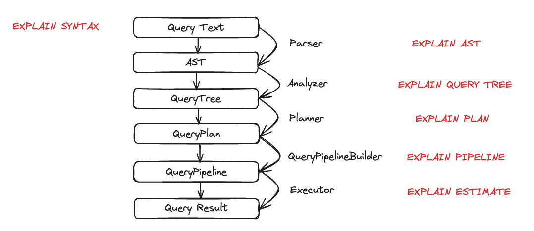
Let’s look at each entity in action during query execution. We are going to take a few queries and then examine them using the EXPLAIN statement.
Parser
The goal of a parser is to transform the query text into an AST (Abstract Syntax Tree). This step can be visualized using EXPLAIN AST:
The output is an Abstract Syntax Tree that can be visualized as shown below:
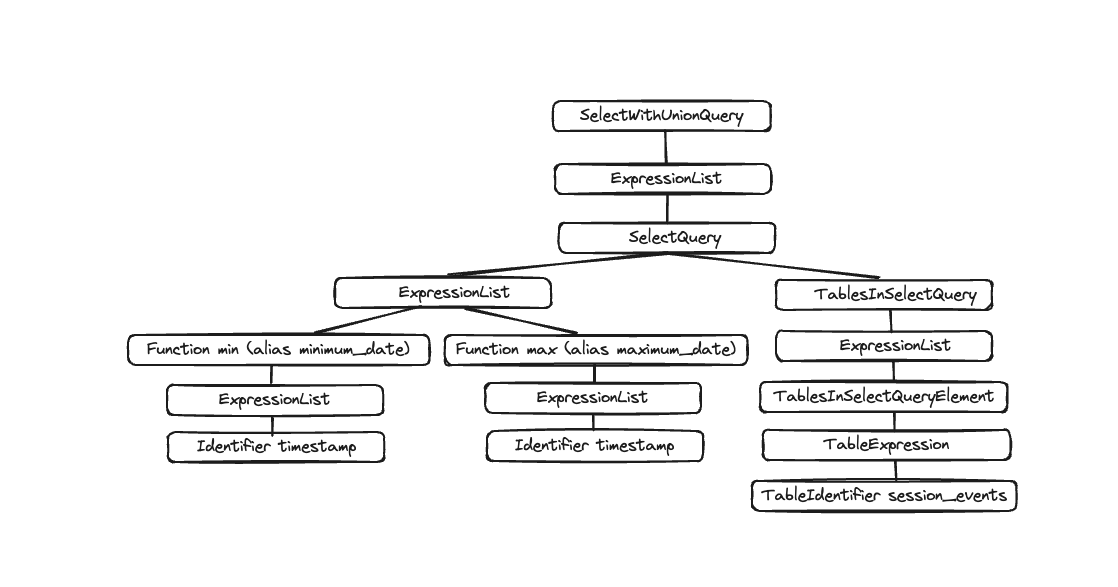
Each node has corresponding children and the overall tree represents the overall structure of your query. This is a logical structure to help processing a query. From an end-user standpoint (unless interested in query execution), it is not super useful; this tool is mainly used by developers.
Analyzer
ClickHouse currently has two architectures for the Analyzer. You can use the old architecture by setting: enable_analyzer=0. The new architecture is enabled by default. We are going to describe only the new architecture here, given the old one is going to be deprecated once the new analyzer is generally available.
The new architecture should provide us with a better framework to improve ClickHouse's performance. However, given it is a fundamental component of the query processing steps, it also might have a negative impact on some queries and there are known incompatibilities. You can revert back to the old analyzer by changing the enable_analyzer setting at the query or user level.
The analyzer is an important step of the query execution. It takes an AST and transforms it into a query tree. The main benefit of a query tree over an AST is that a lot of the components will be resolved, like the storage for instance. We also know from which table to read, aliases are also resolved, and the tree knows the different data types used. With all these benefits, the analyzer can apply optimizations. The way these optimizations work is via “passes”. Every pass is going to look for different optimizations. You can see all the passes here, let’s see it in practice with our previous query:
Between the two executions, you can see the resolution of aliases and projections.
Planner
The planner takes a query tree and builds a query plan out of it. The query tree tells us what we want to do with a specific query, and the query plan tells us how we will do it. Additional optimizations are going to be done as part of the query plan. You can use EXPLAIN PLAN or EXPLAIN to see the query plan (EXPLAIN will execute EXPLAIN PLAN).
Even though this is giving us some information, we can get more. For example, maybe we want to know the column's name on top of which we need the projections. You can add the header to the query:
So now you know the column names that need to be created for the last Projection (minimum_date, maximum_date and percentage), but you might also want to have the details of all the actions that need to be executed. You can do so by setting actions=1.
You can now see all the inputs, functions, aliases, and data types that are being used. You can see some of the optimizations that the planner is going to apply here.
Query Pipeline
A query pipeline is generated from the query plan. The query pipeline is very similar to the query plan, with the difference that it’s not a tree but a graph. It highlights how ClickHouse is going to execute a query and what resources are going to be used. Analyzing the query pipeline is very useful to see where the bottleneck is in terms of inputs/outputs. Let’s take our previous query and look at the query pipeline execution:
Inside the parenthesis is the query plan step, and next to it the processor. This is great information, but given this is a graph, it would be nice to visualize it as such. We have a setting graph we can set to 1 and specify the output format to be TSV:
You can then copy this output and paste it here and that will generate the following graph:
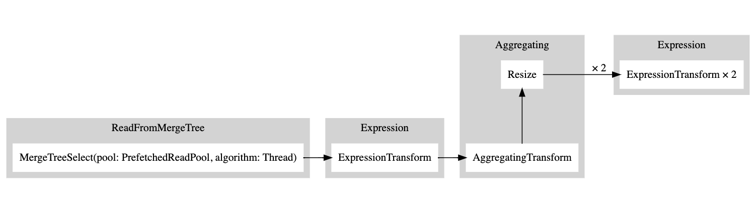
A white rectangle corresponds to a pipeline node, the gray rectangle corresponds to the query plan steps, and the x followed by a number corresponds to the number of inputs/outputs that are being used. If you do not want to see them in a compact form, you can always add compact=0:
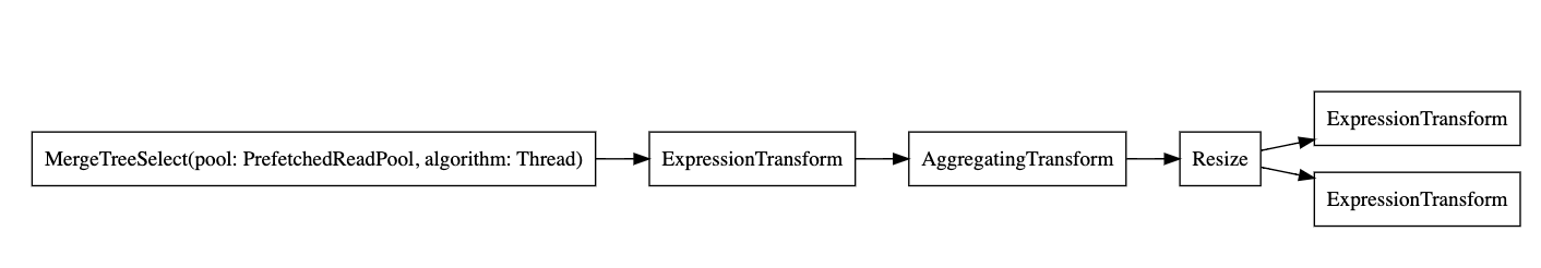
Why does ClickHouse not read from the table using multiple threads? Let's try to add more data to our table:
Now let's run our EXPLAIN query again:
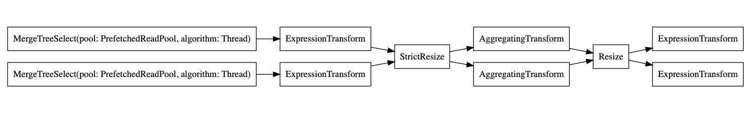
So the executor decided not to parallelize operations because the volume of data was not high enough. By adding more rows, the executor then decided to use multiple threads as shown in the graph.
Executor
Finally the last step of the query execution is done by the executor. It will take the query pipeline and execute it. There are different types of executors, depending if you are doing a SELECT, an INSERT, or an INSERT SELECT.